PRAGUE FIELD NOTES · HOTEL INTERIORS
Inside W Prague: A Designer’s Perspective on Its Hotel Interiors
Observations from my visit to W Prague’s lounge, where sculptural forms, lighting and seating create a distinctive social setting.
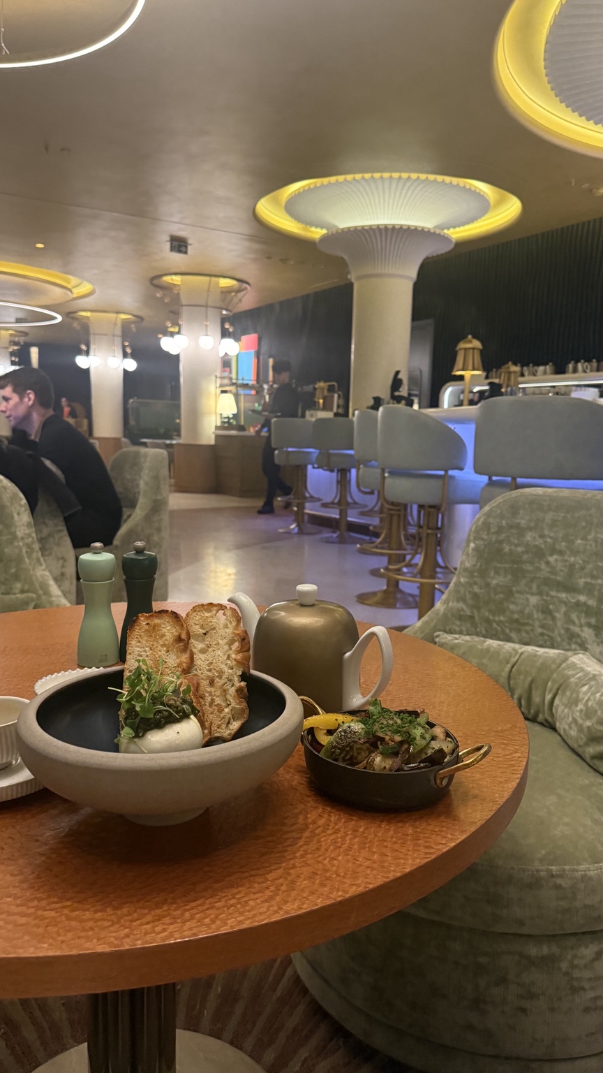
My photograph from W Prague holds two scales of experience in one frame: a meal at a small table and, beyond it, the expressive architecture of the lounge. Pale blue bar stools, sculptural white columns and glowing ceiling rings give the room a strong identity. At the table, upholstered seating, a warm surface and smaller objects make that larger setting feel approachable.
I visited during my Prague trip around INSPIRE 2025. This is a designer’s reading of the lounge I experienced, rather than a review of an overnight stay or the hotel’s guestrooms.
The hotel and its design context
W Prague occupies the former Grand Hotel Evropa on Wenceslas Square. AvroKO’s project account describes a contemporary interpretation of the building’s Art Nouveau heritage. Chapman Taylor, which oversaw renovation of the heritage areas within a collaborative project, records completion in 2024. These credits matter: the interiors are the work of their project team, observed here through my own visit.
The hotel’s dining information identifies W Lounge as one of its social and dining settings. That is the space in my photograph. My observations below concern its visible design choices, without assuming how guests experience every part of the property.
Columns become part of the room’s identity
The columns drew my attention because their upper sections flare outward into finely fluted forms. Circular illuminated recesses above them create a second layer of emphasis. Together, the vertical and horizontal elements establish a recognizable rhythm across the room.
I read these shapes as botanical and sculptural. That is my visual interpretation, rather than a claim about a particular historic reference. Their value as a design lesson lies in how much work one repeated element can do: establish scale, create continuity and draw the eye upward without requiring every surface to compete for attention.
In a hospitality concept, a similarly clear organizing idea can guide many later decisions. The aim would be to find a form that belongs to that project and its setting, rather than reproduce this one.
Lighting gives different surfaces different roles
The ceiling in my photograph carries a warm, luminous quality. The blue light beneath the bar introduces a cooler accent. Dark vertical surfaces behind it allow the lighter columns and stools to remain prominent.
These contrasts suggest a useful way to think about a lounge: where should attention settle at room scale, and what should remain comfortable at table scale? Both questions matter. A striking ceiling does not resolve the light needed to read a menu, see a companion or move safely between seats.
I would test those conditions separately in a new project, through lighting coordination and mock-ups where appropriate. The photograph is a record of atmosphere, not a measurement of the room’s lighting performance.
Seating makes a large space personal
The upholstered armchair beside my table and the row of bar stools offer different relationships to the room. One allows a visitor to sit within a smaller setting; the other faces the shared activity of the bar. Their rounded profiles also soften the transition from the more monumental columns.
This is a practical lesson for hotel lounge design. “Social” does not describe a single posture or occasion. Guests may arrive alone, meet another person, pause over a meal or choose a place close to activity. A seating plan can acknowledge those differences through grouping, orientation and the distance between settings.
Those decisions also need operational testing. Routes for staff, accessible circulation, table clearances and the ease of moving a chair belong in the same conversation as its silhouette.
Materials create relationships across scales
From my seat, the copper-toned table surface, green upholstery and pale blue stools formed a palette with both warmth and contrast. The dark background gave the lighter elements definition. What interested me was the relationship between finishes, rather than any one material treated as the emblem of luxury.
A material palette becomes more convincing when it can work at several distances: an overall impression on arrival, a comfortable grouping within the room and a satisfying detail close to the hand. The durability and care of those finishes would then need to be evaluated against the operating brief.
A lesson to take into another project
My W Prague visit reinforced the importance of a coherent design language that still offers different ways to use a room. The sculptural ceiling treatment creates a shared identity. Seating and tabletop details bring the experience closer to the individual.
For SOMA, that relationship between the whole and the intimate is a useful part of early interior planning. Read my wider INSPIRE Prague reflections, or discuss a hospitality interior brief with the studio.
About the author: Tatiana Mozerova is the founder of SOMA Design Studio in Charlotte, North Carolina. Her work brings interior design, spatial experience and material direction together through the studio’s Quantum Architecture™ approach.